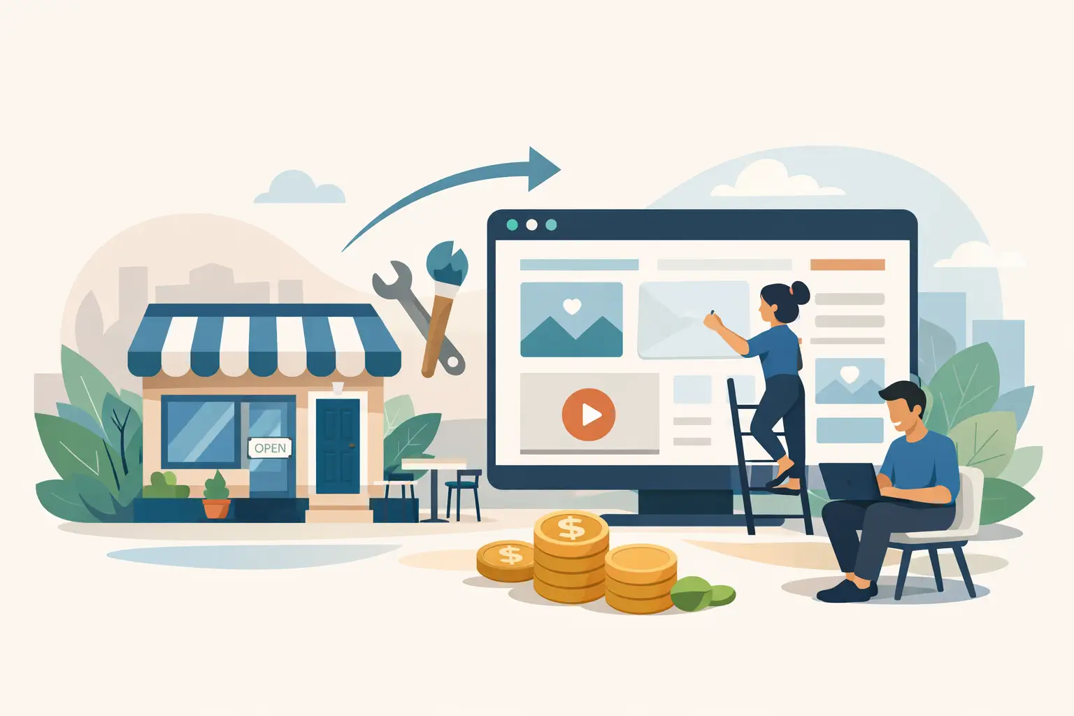
A lot of small businesses do not have a traffic problem. They have a leak problem.
You can run ads, invest in SEO, post on social media, and finally get the right people to your site – only to watch them bounce because the page is slow, confusing, generic, or asking for trust it has not earned. That is where landing page optimization for leads stops being a marketing extra and starts becoming a revenue decision.
If your landing page is not producing calls, quote requests, bookings, or form submissions, the issue usually is not one big disaster. It is a stack of smaller conversion killers working together. Weak headline. Vague offer. Too many choices. Poor mobile layout. Friction in the form. No proof. No urgency. No clear next step. Fix those, and the same traffic can produce a very different result.
What landing page optimization for leads really means
At its core, landing page optimization for leads is the process of improving a page so more visitors take a meaningful action. That action might be booking a consultation, requesting an estimate, calling your office, filling out a contact form, or claiming an offer.
This is not about making a page look more modern just for the sake of it. A polished design helps, but looks alone do not carry the load. A high-converting landing page does four jobs well. It matches the visitor’s intent, makes the offer easy to understand, reduces hesitation, and makes the next step feel simple.
Think of it like a sales conversation. If a prospect lands on your page and has to figure out what you do, who it is for, why they should trust you, and what to do next, you are asking them to do the selling for you. Most will not bother.
Why most landing pages underperform
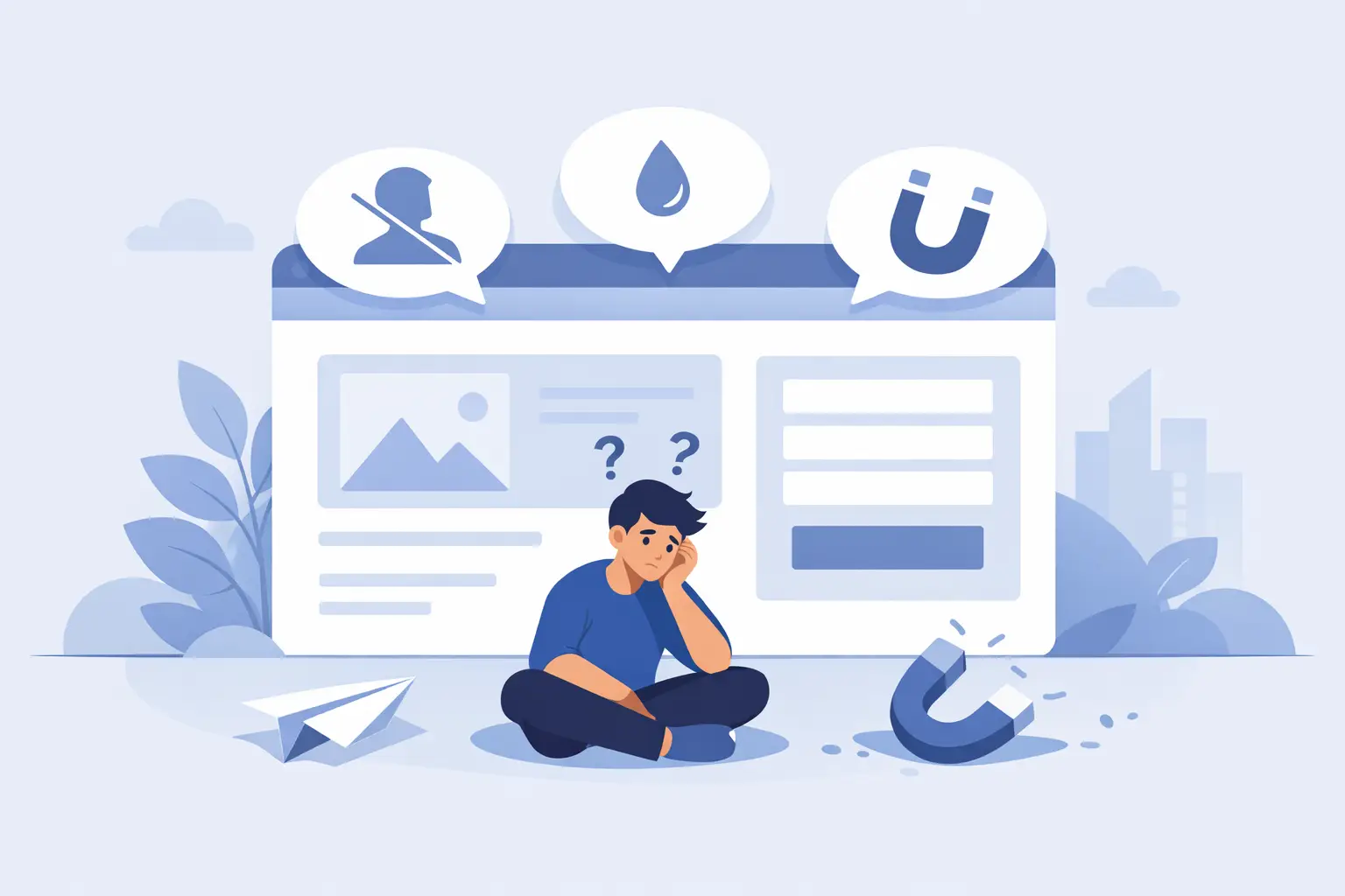
The biggest issue is message mismatch. Someone clicks an ad about emergency plumbing, tax planning, personal training, or legal help, and lands on a page that talks in broad company language instead of speaking to the problem they came to solve. That disconnect kills momentum fast.
The second issue is clutter. Business owners often try to make one page do everything – explain the company, list every service, show the full navigation, tell the brand story, and capture a lead. The result is a page with no clear priority. When everything is important, nothing stands out.
Then there is friction. Long forms, slow load times, hard-to-tap buttons, walls of text, weak mobile layouts, and buried contact options all create tiny moments of resistance. Each one lowers conversion odds. Together, they can turn a promising campaign into wasted spend.
Trust is another common gap. Visitors are skeptical, especially if they have never heard of your business before. If your page makes claims without evidence, people hesitate. Testimonials, review snippets, certifications, results, before-and-after examples, and clear business details all help reduce that hesitation.
Start with intent, not design
Most owners want to jump straight into layout changes. Wrong starting point.
Before changing the page, get clear on why the visitor is there. What did they search for? What ad did they click? What problem are they trying to solve today, not someday? A page aimed at someone comparing options will need a different message than a page aimed at someone ready to book now.
This is where a lot of businesses bleed cash. They send paid traffic to pages built around the company instead of the buyer. Your landing page should feel like the natural next step after the click. Same problem. Same promise. Same audience. No mental gear shift.
A strong page usually performs best when it is tightly focused on one service, one audience, and one primary action. That does not mean every page must be stripped down to nothing. It means every section should support the conversion goal instead of distracting from it.
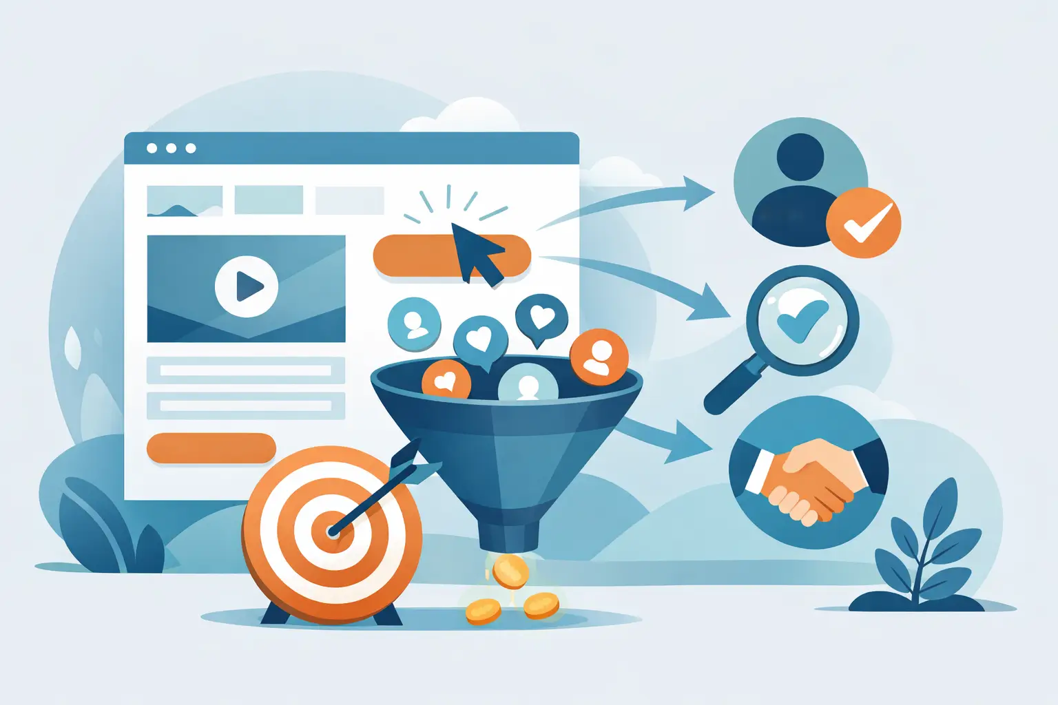
The elements that move lead conversion
The headline is the first test. It should make the offer obvious in seconds. Clarity beats cleverness almost every time. If a visitor has to decode your message, you have already lost ground.
Right under that, your supporting copy needs to answer the buyer’s immediate questions. What do you do? Who is this for? What outcome can I expect? Why should I trust you? Why should I act now? You do not need hype. You need direct, credible language.
Your call to action matters more than many businesses realize. “Submit” is weak. “Get My Free Estimate,” “Book a Consultation,” or “Request a Call Back” tells the visitor what happens next. Specific calls to action reduce uncertainty, and uncertainty is poison for conversion.
Forms need discipline. Every extra field can lower completion rates, especially on mobile. If you only need a name, email, phone number, and a short message, do not ask for company size, budget range, favorite color, and how they found you. More data is not always better if fewer people complete the form.
Social proof should be relevant, not decorative. One strong testimonial from the kind of customer you want is better than a generic pile of praise. If you can show outcomes, even better. People want to know that someone like them trusted you and got a result.
Visual hierarchy also plays a bigger role than many assume. The page should guide attention. Strong headline. Key benefit. Proof. Call to action. Supporting details. If everything is competing for attention, the page feels noisy and uncertain.
Mobile performance is not optional
Most small business traffic now comes from phones, yet many landing pages are still built like desktop brochures. Tiny text, cramped forms, oversized images, sticky popups, and slow scripts are all conversion killers.
A page can look fine on a laptop and fail badly on a phone. That matters because mobile visitors are usually less patient and more distracted. They are also often closer to taking action. Someone searching from their phone for a contractor, dentist, med spa, or attorney may be ready to call now. If your page makes that hard, they will move on.
Page speed deserves special attention here. Slow pages do not just frustrate users. They break momentum. When someone clicks with intent, every extra second gives doubt time to enter the room. Better hosting, cleaner code, compressed media, and fewer bloated plugins can make a measurable difference.
Testing matters, but not every test is smart
A lot of businesses hear “optimization” and think nonstop A/B testing. Testing is useful, but random testing is just motion.
Start with the biggest conversion levers first. Test the headline before changing button shades. Test the offer before tweaking icon styles. Test shorter forms, stronger trust proof, a clearer call to action, or a better page structure. Those changes have a higher chance of moving real numbers.
It also helps to look at the quality of leads, not just the quantity. A page can increase form submissions and still hurt the business if those leads are unqualified. Sometimes a more specific headline or tighter copy lowers volume but improves close rate. That is not a loss. That is better filtering.
This is why context matters. A local service business may want more calls from nearby buyers ready to book. A B2B firm may care more about fewer, higher-value inquiries. Good optimization is not about chasing a vanity conversion rate. It is about generating leads that are worth your team’s time.
Common fixes that usually produce quick gains
If your page is underperforming, there are a few areas that often create the fastest lift. Sharpen the headline so it mirrors the visitor’s intent. Cut anything that distracts from the primary action. Reduce form friction. Add real trust indicators near the call to action. Improve mobile spacing and button visibility. Make the offer concrete instead of vague.
Sometimes the right move is bigger. If the page is trying to serve multiple audiences at once, split it. If traffic from ads and organic search have different intent, give them different landing experiences. If the page promises one thing but the form asks for another, fix the transition. Small tweaks help, but structural mismatch usually needs a stronger correction.
For businesses serious about growth, this work compounds. Better landing pages make your ad spend more efficient, improve lead flow from existing traffic, and raise the return on your SEO and marketing efforts. That is why optimization is not a design task sitting off to the side. It is part of how the business acquires customers.
At GillyTech, that is the lens we use. A landing page is not there to look busy. It is there to do a job.
A better page changes the economics
When a landing page starts converting at a higher rate, the upside is bigger than most owners expect. You can often generate more leads without increasing traffic. That means less waste, lower acquisition costs, and more value from channels you are already paying for.
And when the page is built around clear messaging, technical performance, and a credible offer, your business feels easier to trust. That matters. People do business with companies that look like they know what they are doing.
If your current page feels like a polite brochure when it should be closing for the next step, that gap is costing you more than you think. The good news is that leaks can be fixed. Start with what the visitor wants, remove friction, prove your case, and make action easy. A stronger landing page will not just look better on screen. It will pull more weight in the business.