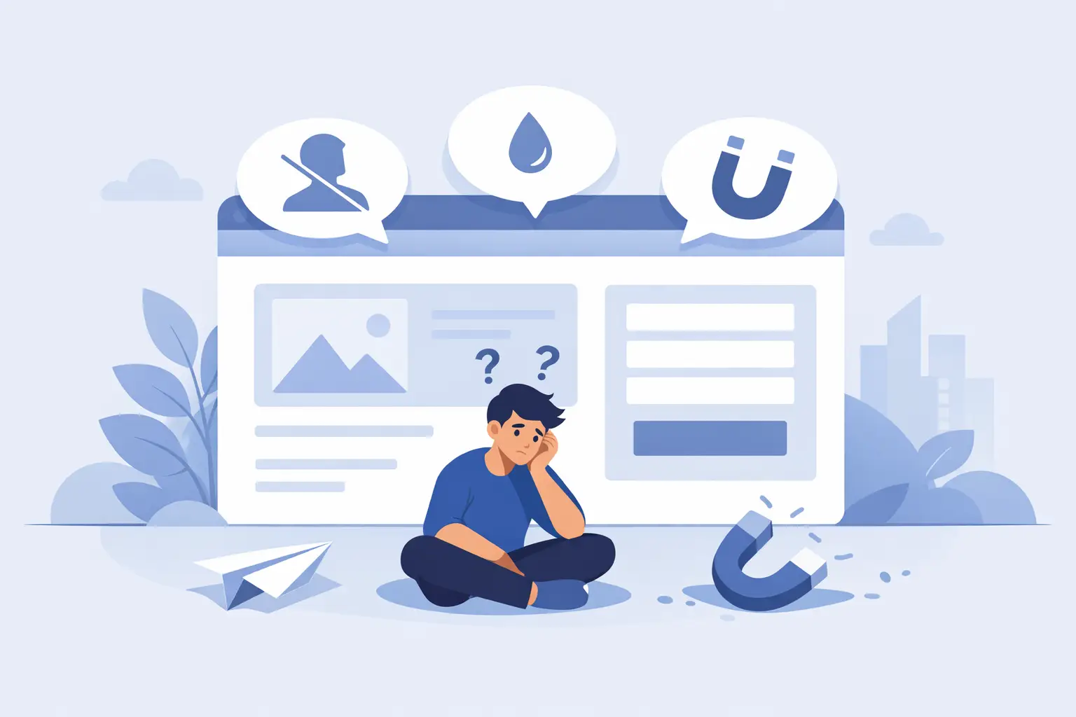
A lot of small business websites have the same expensive problem: they get traffic, but they do not get action. People land on the site, skim for a few seconds, then disappear. If you are wondering how to improve website conversion rate, the answer usually is not more traffic. It is fixing the leaks in the site you already have.
That matters because traffic costs money, whether you are paying for SEO, ads, networking, social content, or referrals. When your website fails to turn visitors into calls, form fills, bookings, or sales, it is not just underperforming. It is bleeding opportunity.
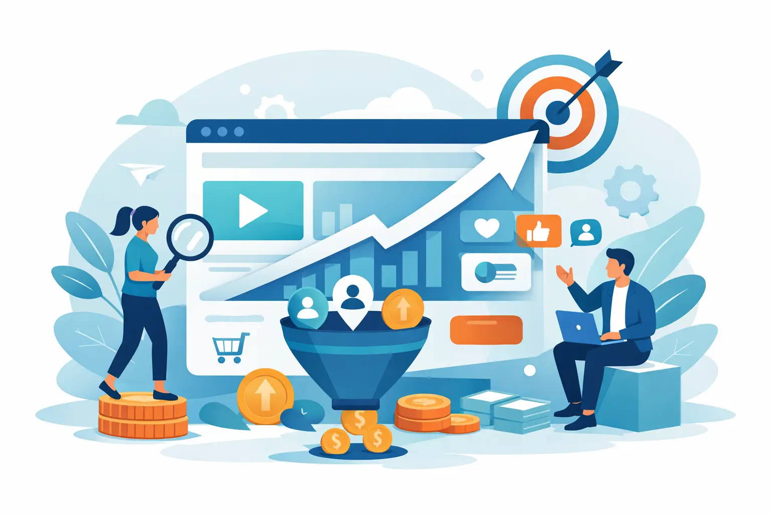
What conversion rate actually measures
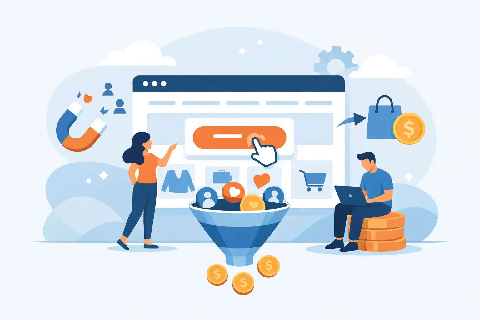
Your conversion rate is the percentage of visitors who take a desired action. That action might be submitting a contact form, booking a consultation, making a purchase, calling your business, or signing up for a quote. A site with 1,000 visitors and 20 leads converts at 2 percent. If that same site starts converting at 4 percent, you just doubled results without doubling traffic.
That is why conversion work matters so much for small businesses. It is one of the fastest ways to increase revenue from your existing marketing. But improving conversion rate is not about random tweaks or copying whatever design trend is popular this month. It is about reducing friction, increasing clarity, and giving visitors a reason to trust you now.
How to improve website conversion rate where it counts
Most sites do not have one giant problem. They have five or six smaller ones working together. Weak messaging. Slow mobile performance. Confusing calls to action. Thin trust signals. Forms that ask for too much too soon. Each issue seems minor on its own, but stacked together, they kill momentum.
The fix starts with a simple question: when the right visitor lands on your site, is the next step obvious?
If the answer is not an immediate yes, start there.
Tighten the message above the fold
Your homepage hero section has a job to do. It should tell people what you do, who it is for, and what they should do next. Fast. If a visitor has to scroll, guess, or decode vague copy, you are losing them.
Too many businesses lead with clever headlines that sound polished but say nothing. Your visitor is not looking for poetry. They want confirmation that they are in the right place. A better headline is specific, outcome-driven, and grounded in customer intent.
For example, compare a soft line like “Solutions for Modern Growth” with something plain and useful like “Custom Websites That Turn More Visitors Into Leads.” One sounds nice. The other sells.
Give every page one primary goal
A website cannot push five priorities at once and expect people to act. If a page asks visitors to call, email, subscribe, read the blog, follow on social, download a guide, and request a quote, it creates paralysis.
Every key page should have one primary conversion goal and one clear call to action. That does not mean you can never include secondary actions, but they should support the main objective, not compete with it.
A service page might be built to drive quote requests. A landing page might be built for booked calls. An ecommerce product page might be built for add-to-cart clicks. Keep the hierarchy clean. Confused visitors do not convert.
Reduce friction in forms and booking flows
Long forms are lead killers, especially on mobile. If someone has to fill out 12 fields just to ask a basic question, many will leave. Ask only for what you need to move the conversation forward.
Name, email, phone, and one short message field is often enough for service businesses. If your sales process needs more detail, collect it later. The goal of the first conversion is not to gather every possible data point. It is to start the relationship.
The same rule applies to scheduling tools and checkout flows. Every extra click, every unnecessary field, and every moment of hesitation lowers completion rates. Shorter paths usually win.
Fix the trust gap before asking for action
A lot of sites ask for the lead before they earn the trust. That is backwards.
People need proof. They want to know you are legitimate, capable, and worth contacting. If your site makes big promises but offers no evidence, visitors will keep shopping.
Add proof where decisions happen
Trust signals work best when they appear close to calls to action, not buried on a separate page nobody reads. That can include testimonials, review snippets, client logos, certifications, years in business, case study results, or even simple statements that reduce perceived risk.
The details matter here. A testimonial that says, “Great service” is weak. A testimonial that says, “We started getting qualified leads within weeks and finally stopped wasting money on a site that looked good but did nothing” carries weight.
Specificity builds credibility. Generic praise does not.
Make your business feel real
Small business buyers are cautious, especially in higher-ticket services. They want to know there are real people behind the website. That means clear contact information, a polished About page, real team photos if appropriate, and messaging that sounds human.
If your site feels anonymous, stock-heavy, or strangely corporate, it creates distance. People buy faster when the business feels accessible and accountable.
Speed and mobile performance are conversion issues
This is where many businesses lose money without realizing it. A slow site does not just hurt rankings. It kills conversion intent.
If your page drags on mobile, visitors bounce before they even read the offer. If buttons are hard to tap, layouts break on smaller screens, or key content gets buried, you are making it harder for ready-to-buy people to take action.
Why performance affects revenue
Visitors do not separate design from functionality. They experience your site as one thing. If it feels slow, clunky, or unreliable, that feeling transfers to your business. Fair or not, people assume your service experience may be the same.
Improving image compression, reducing bloated scripts, using better hosting, and simplifying page structure can lead to meaningful gains. This is not glamorous work, but it often produces a bigger return than cosmetic redesigns.
For businesses serious about how to improve website conversion rate, technical cleanup is not optional. It is part of the sales process.
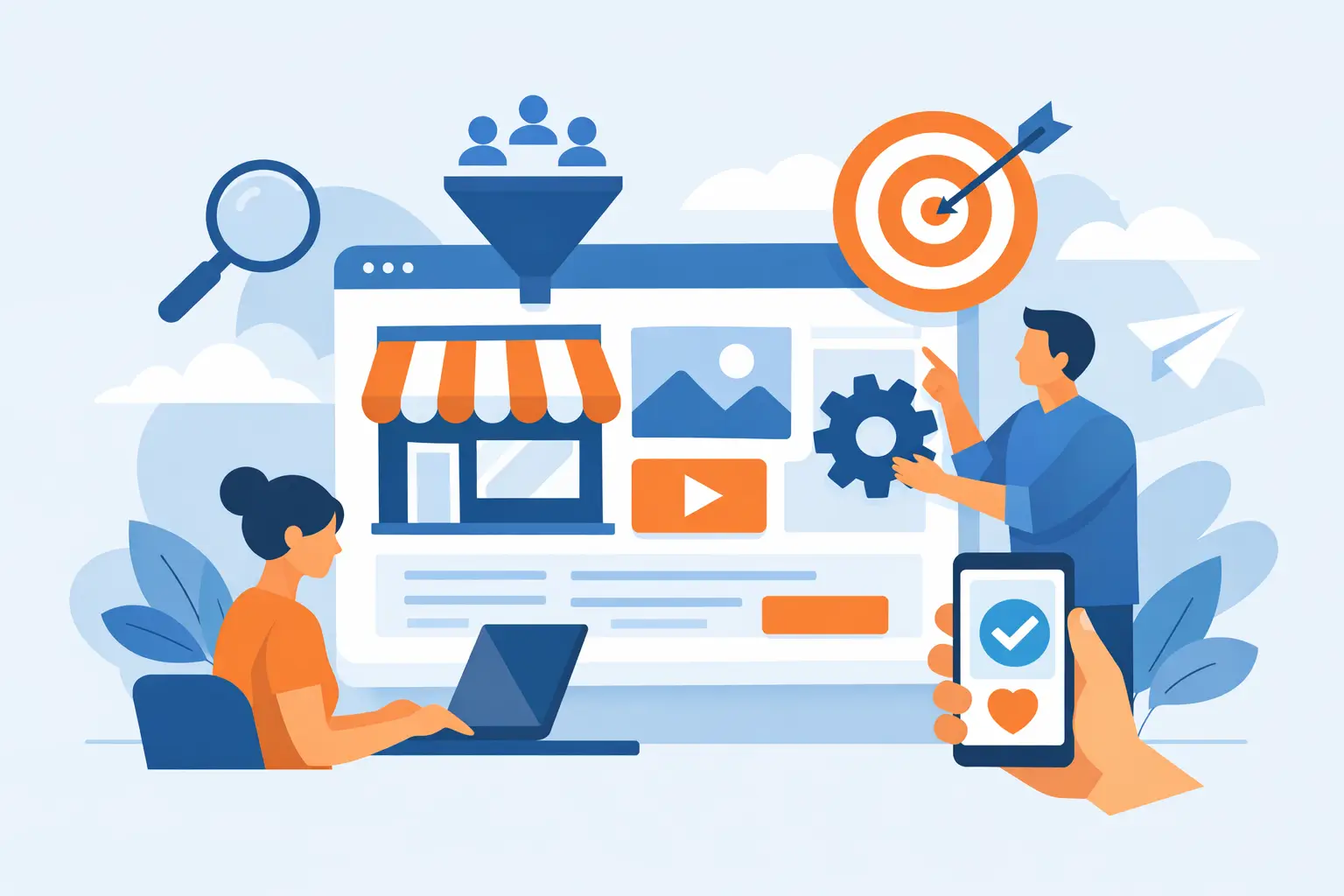
Match the page to visitor intent
Not every visitor wants the same thing, and that is where many websites get lazy. Someone searching for a specific service is different from someone casually browsing your homepage. Someone clicking an ad has different expectations than someone referred by a friend.
Your pages should reflect that.
Build pages for real buying decisions
A strong service page answers the questions a buyer actually has. What is this service? Who is it for? What problem does it solve? Why choose you? What happens next?
A strong landing page is even tighter. It removes navigation distractions, keeps the message aligned with the traffic source, and pushes one clear action. If you are sending paid traffic to a generic homepage, there is a good chance you are wasting money.
This is where strategy matters more than aesthetics. Pretty pages do not automatically convert. Relevant pages do.
Test the obvious before chasing advanced tactics
A lot of business owners think conversion optimization means heatmaps, split testing platforms, and endless experiments. Those tools can help, but most small businesses do not need a lab coat. They need better fundamentals.
Start with the obvious friction points. Rewrite the headline. Strengthen the offer. Move testimonials closer to the form. Simplify navigation. Shorten the form. Improve mobile speed. Make the primary call to action more visible.
Then measure what changes.
Focus on the pages that matter most
You do not need to optimize every page at once. Start with the ones closest to revenue: homepage, key service pages, landing pages, contact page, and checkout or booking pages. Those are your money pages.
If one of those pages gets decent traffic but poor conversions, that is your low-hanging fruit. Fixing it can have an outsized impact.
At GillyTech, this is often the turning point for clients. They stop treating the website like a digital brochure and start treating it like a sales asset. That shift changes the questions they ask and the results they expect.
What to improve first if your site is underperforming
If your website is not converting, do not start with colors or trendy animations. Start with the basics that move money.
Look at your headline and first screen. Is the value clear? Look at your call to action. Is it specific and easy to find? Look at your mobile experience. Is it fast and painless? Look at your trust signals. Do they appear near moments of decision? Look at your forms. Are you asking for too much?
That is how to improve website conversion rate in the real world. Not with magic tricks. Not with jargon. By making it easier for the right person to say yes.
A good website should not sit there looking polished while leads slip through the cracks. It should pull its weight, earn trust quickly, and give your business a better return on every visitor you worked to get. If your site is leaking opportunities, the fix is usually closer than you think.