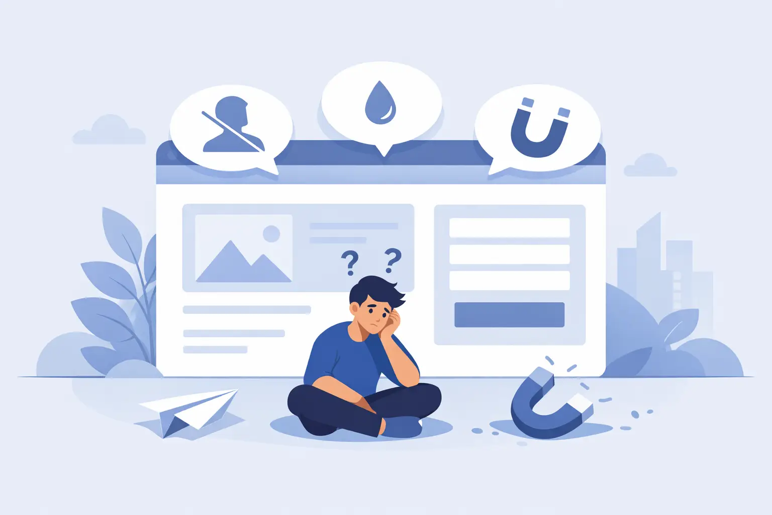
You paid for the website. Maybe you even paid good money. It looks decent, the logo is clean, the pages load well enough on your laptop, and people tell you it feels professional. So why is my website not generating leads? That question usually shows up when the site is acting like a brochure while the business needs a salesperson.
A lead-generating website has a job. It should attract the right people, make the offer clear, build trust fast, and move visitors toward one specific next step. When any part of that chain breaks, traffic turns into wasted clicks, and wasted clicks turn into wasted money.
Why is my website not generating leads? Start with the real job of the site
Most small business websites fail for a simple reason: they were built to exist, not to convert. They say, “here’s who we are,” but they never answer the questions a prospect is asking in the first 10 seconds. Can you help me? Are you credible? What exactly should I do next?
If your homepage leads with vague branding language, stock-photo smiles, and generic claims like “quality service” or “we care about our customers,” you’re asking visitors to do too much work. People do not arrive ready to study your business. They scan. They judge. They leave.
That does not mean every website needs to sound like a used-car ad. It does mean clarity beats cleverness. A site that converts usually makes the offer obvious, the value specific, and the next action friction-free.
Traffic problems and conversion problems are not the same thing
A lot of owners lump everything into one complaint: “the website isn’t working.” Fair enough. But there are two very different failures hiding inside that sentence.
The first is a traffic problem. Not enough qualified people are finding you through search, referrals, ads, maps, social, or direct brand searches. The second is a conversion problem. People are landing on the site, but they are not contacting you, booking, calling, or filling out the form.
You need to know which one you have. If your traffic is tiny, redesigning the contact form will not save you. If traffic is healthy but leads are flat, buying more traffic just pours water into a leaky bucket.
This is where many businesses bleed cash. They keep paying for ads, SEO, or social content without fixing the page experience that turns attention into action.
You may be attracting the wrong visitors
Not all traffic is good traffic. A ranking page can bring in curious readers, bargain hunters, job seekers, or people outside your service area. That looks nice in analytics, but it does not pay the bills.
If your site speaks too broadly, it often pulls in the wrong audience. A law firm, contractor, fitness studio, or creative agency needs messaging that filters as much as it attracts. Better to get 200 right-fit visitors than 2,000 people who will never buy.
You may have enough traffic, but weak intent capture
Sometimes the problem is not volume. It is timing. A visitor might be interested, but if your page buries the call to action, asks for too much too soon, or fails to answer obvious objections, that interest evaporates.
The best websites capture intent while it is hot. They make it easy to call, book, request a quote, or ask a question without turning the process into paperwork.
Your messaging may be costing you more than your design
Design matters. Bad design kills trust. But weak messaging quietly does even more damage because it confuses the buyer.
A lot of websites talk about the business instead of the customer’s problem. They list services, credentials, and company history, but they never connect the dots. What changes for the client after hiring you? What pain do you remove? What result do you create? Why should someone choose you instead of the next tab over?
If your copy is full of broad words like solutions, excellence, innovative, or customized, it probably sounds polished but says very little. Strong messaging is concrete. It names the problem, speaks to the stakes, and shows a clear path forward.
That means your headline should not try to win an award. It should tell the right visitor they are in the right place.
Trust is fragile, and your website may be breaking it fast
People do business with websites they trust. That trust forms quickly and disappears even faster. One outdated design cue, one sloppy mobile experience, one unclear service page, and the visitor starts wondering what else is disorganized behind the scenes.
Trust blockers are often boring, which is exactly why they get ignored. Thin service pages, outdated photos, missing reviews, no proof of results, weak before-and-after examples, generic testimonials, or no visible local relevance can all reduce conversions. So can obvious technical issues like broken layouts, intrusive popups, and forms that feel clunky.
If you are asking someone to spend thousands of dollars or hand over their contact information, the site needs to feel credible. Not trendy. Credible.
Social proof has to do real work
A testimonial that says “great service” is filler. Real proof includes specifics: what problem was solved, what the process felt like, and what result came from it. The same goes for case studies, project examples, certifications, years in business, client logos, and guarantees. They should reduce risk, not decorate the page.
Your calls to action may be too weak, too vague, or too hidden
If every page ends with “Contact us,” you are leaving money on the table. That phrase is passive and generic. It does not answer the question in the visitor’s head: why should I take this step now?
Good calls to action are tied to intent. “Book a consultation,” “Get a quote,” “Schedule a walkthrough,” or “See if we’re a fit” gives the action more shape. It also helps to explain what happens next. People are more likely to submit a form when they know they will hear back within a set timeframe, from a real person, with a clear next step.
And yes, placement matters. If your call to action only appears at the bottom of a long page, many visitors will never see it. Key actions should appear early, naturally, and often enough to be obvious without feeling desperate.
Why is my website not generating leads on mobile?
Because mobile visitors are less patient, less forgiving, and often closer to taking action.
A desktop site can look fine while the mobile version quietly kills conversions. Text may be too small, buttons may be hard to tap, forms may feel annoying, and key trust elements may get pushed far down the page. If someone is searching from their phone and wants help now, every extra second and every extra field reduces the odds of a lead.
Site speed also matters more than many owners realize. A slow website does not just frustrate users. It lowers trust. People associate lag with risk. If your page takes too long to load, they do not sit there admiring your branding. They bounce.
SEO might not be the issue – or it might be exactly the issue
Business owners often ask whether SEO is the missing piece. Sometimes it is. If your site is not visible for the services and locations that matter, your lead problem starts before conversion even has a chance.
But SEO is not magic traffic dust. Ranking for the wrong terms, publishing content with weak commercial intent, or getting impressions without clicks will not create pipeline. The real goal is qualified visibility. You want to show up when the right prospect has the right problem and is ready to act.
That requires pages built around actual buyer intent, not just keyword stuffing or random blogging. It also requires technical health, clean site structure, and pages that deserve to rank because they genuinely help the visitor make a decision.
The fix is usually not one big thing
Most underperforming websites are not failing because of one catastrophic flaw. They are failing because of several smaller leaks happening at once. Weak positioning. Thin copy. Slow pages. Poor mobile UX. Low trust. Muddy offers. Generic calls to action. Spotty traffic quality.
That is why surface-level fixes often disappoint. Changing a button color will not rescue a page with unclear messaging. A prettier homepage will not solve poor search visibility. More traffic will not save a site that cannot convert warm visitors.
What works is diagnosis before redesign. Look at traffic quality, bounce behavior, mobile experience, page speed, conversion paths, form completion, and message clarity together. The website should be treated like a sales system, not a digital ornament.
For businesses that are serious about growth, this is where a partner like GillyTech can make the difference between “we have a website” and “our website brings in business.” The gap is strategy, execution, and a willingness to fix what is actually costing revenue.
If your site is not generating leads, do not assume the internet stopped working for your business. More often, the signal is there. The site just is not doing its job yet.