A lot of small business websites look decent and still fail at the one job that matters – turning traffic into calls, form fills, bookings, or sales. That is where conversion focused web design separates itself from pretty-but-passive websites. It is not about trends, flashy animations, or winning compliments from other designers. It is about getting a visitor to take the next step without friction, confusion, or hesitation.
If your site gets traffic but not enough leads, you do not have a traffic problem alone. You may have a conversion problem. And when that happens, every dollar you spend on SEO, ads, social media, or referrals gets less effective because the website is acting like a leaky bucket.
What conversion focused web design really means
Conversion focused web design is the practice of building pages around business outcomes first. Every design decision supports a goal. That goal might be scheduling a consultation, requesting a quote, making a purchase, signing up for a demo, or calling your office.
This sounds obvious, but most websites are built backward. The process often starts with colors, layouts, and inspiration boards. Then someone drops in generic copy, adds a contact form at the bottom, and hopes people figure it out. That is not strategy. That is decoration.
A conversion-focused site starts with sharper questions. Who is the ideal customer? What problem are they trying to solve? What do they need to believe before they contact you? What objections slow them down? What page elements help them trust you faster? Once those answers are clear, design becomes a sales tool instead of a digital brochure.
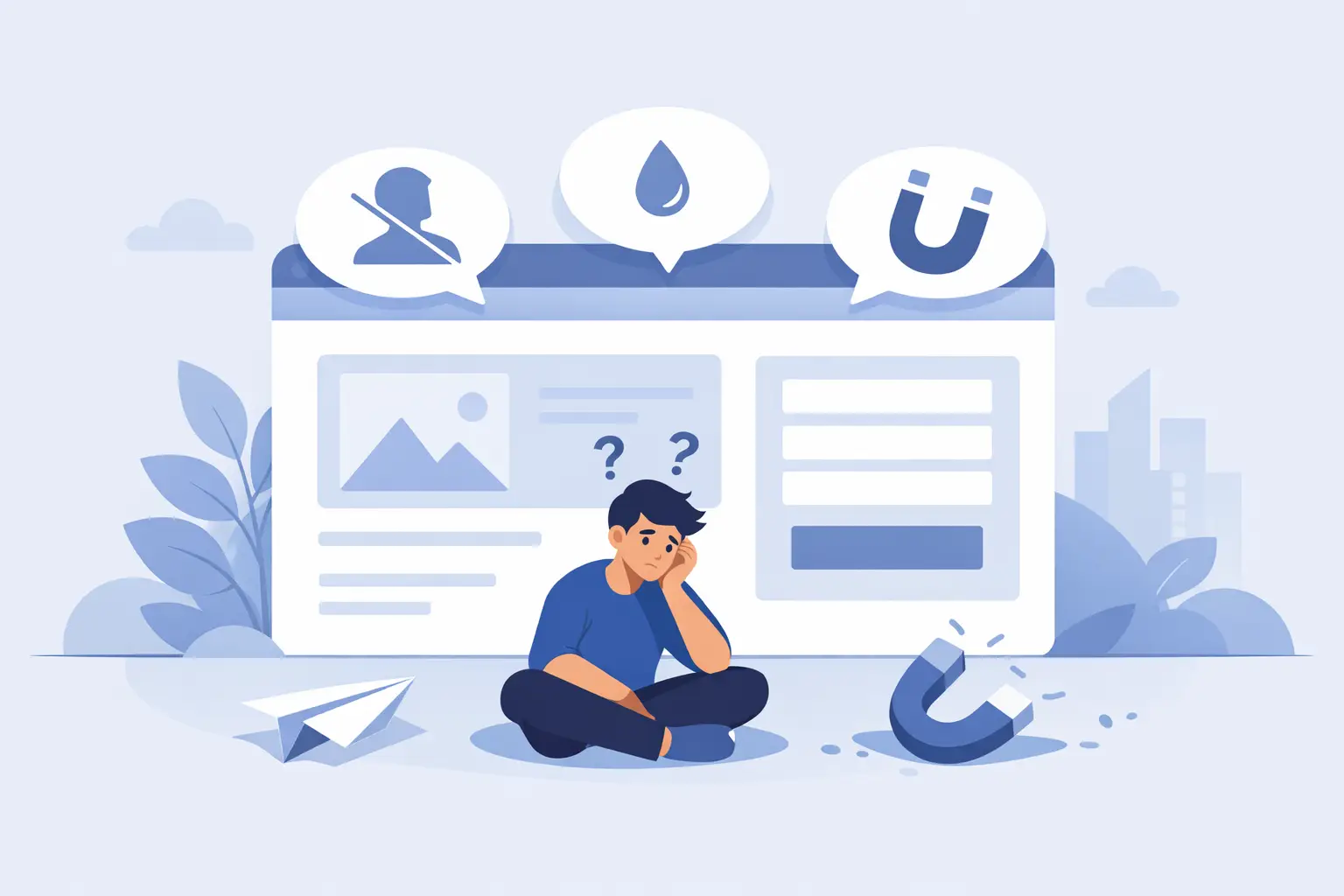
Why attractive websites still underperform
A clean website can still lose money. This happens all the time.
Sometimes the messaging is vague. Visitors land on the page and cannot tell what the business does, who it helps, or why it is different. Sometimes the call to action is weak or buried. Sometimes the mobile experience is clumsy, which is a serious problem when a large share of traffic comes from phones. Sometimes the site loads slowly enough to make people bounce before they even read the headline.
Then there is credibility. People do not convert because a site looks modern. They convert because the site answers their questions quickly and reduces perceived risk. A polished design helps, but polish alone is not persuasion.
That is the trade-off many businesses miss. If you chase visual style without thinking about buyer behavior, the site may look expensive while producing very average results. Good design matters, but commercial design matters more.
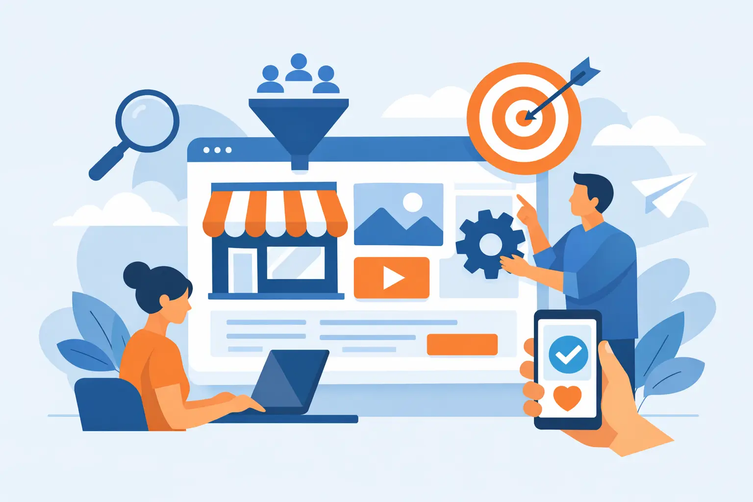
The pieces that drive conversions
The strongest websites usually get a few fundamentals right at the same time.
Clear messaging above the fold
The first screen has to do heavy lifting. Visitors should know what you offer, who it is for, and what action to take next within seconds. If they have to hunt for clarity, you are already losing momentum.
A strong headline is specific. A strong subheading adds context. A strong primary call to action gives people a clear next step. This is not the place for clever wordplay that sounds good but says nothing.
Design that supports the decision
Layout matters because attention is limited. Strong visual hierarchy guides the eye from problem to solution to action. Good spacing improves readability. Buttons need contrast. Forms should ask for what is necessary, not everything under the sun.
This does not mean every website should look identical. Brand personality still matters. But a site should never express personality at the expense of clarity.
Trust signals in the right places
Most visitors are skeptical by default. They need proof. Reviews, testimonials, certifications, client logos, guarantees, years in business, before-and-after examples, and concise case study snapshots can all help.
Placement matters as much as inclusion. Trust signals work best near moments of hesitation, not hidden on a separate page nobody reads.
Speed and mobile performance
A slow website is not a minor technical issue. It is a conversion killer. Delays increase drop-off, especially on mobile, where attention is shorter and patience is lower.
Fast hosting, optimized images, lean code, and disciplined plugin use all matter here. So does designing for thumbs, not just desktop mice. If buttons are hard to tap, text is cramped, or forms are annoying on mobile, the site is making prospects work too hard.
Intent-based page structure
Different visitors need different pages. Someone searching for a specific service may need a focused service page. Someone clicking an ad may need a tighter landing page with fewer distractions. Someone comparing vendors may need more proof and detail.
This is where it depends. A local service business may benefit from short, direct pages with phone-first calls to action. A higher-ticket B2B firm may need longer pages with more education, process detail, and trust-building content. The right structure depends on your customer, price point, and buying cycle.
Conversion focused web design is not just about buttons
A lot of people hear the word conversion and think about button color tests or pop-ups. That is the shallow version.
Real conversion work goes deeper. It sits at the intersection of positioning, copywriting, user experience, technical performance, and buyer psychology. If the offer is weak, no layout will save it. If the messaging is generic, a prettier hero section will not fix the problem. If the site is slow, your best headline still loses impact.
That is why piecing together random tactics rarely works. Changing one button or adding one testimonial can help, but meaningful gains usually come from fixing the whole path. The page needs to attract the right person, hold attention, build trust, and make action feel easy.
Common mistakes that make a website bleed cash
The most expensive website mistakes are often the quiet ones.
One is trying to say too much at once. When every service, audience, and claim gets shoved onto the same page, clarity disappears. Another is weak calls to action like “Learn More” when the real goal is to generate leads. Another is designing for the business owner instead of the buyer. Your visitors care less about your favorite brand colors and more about whether you can solve their problem.
There is also the issue of disconnected marketing. Businesses spend money to get traffic, then send people to pages that do not match the ad, keyword, or referral intent. That mismatch kills conversion rates. Message match is not fancy. It is basic. But when it is missing, results suffer fast.
And of course, there is neglect. Outdated sites with broken forms, old testimonials, and clunky page builders do not just look stale. They signal risk. People notice more than business owners think.
How to know if your site needs a conversion overhaul
You do not need advanced analytics to spot trouble. If people visit but rarely contact you, if paid traffic feels too expensive, if mobile users bounce, if your homepage gets compliments but not leads, something is off.
Look at the basics. Can a first-time visitor understand your offer in five seconds? Is the next step obvious? Do your key pages build trust before asking for action? Does the mobile version feel easy to use? Is the site fast enough to keep attention? If several of those answers are no, your website is likely underperforming.
This is where a more strategic partner makes a difference. A business like GillyTech looks at the website the way a direct-response marketer and technical operator would. Not as a design artifact, but as an acquisition system that should pull its weight.
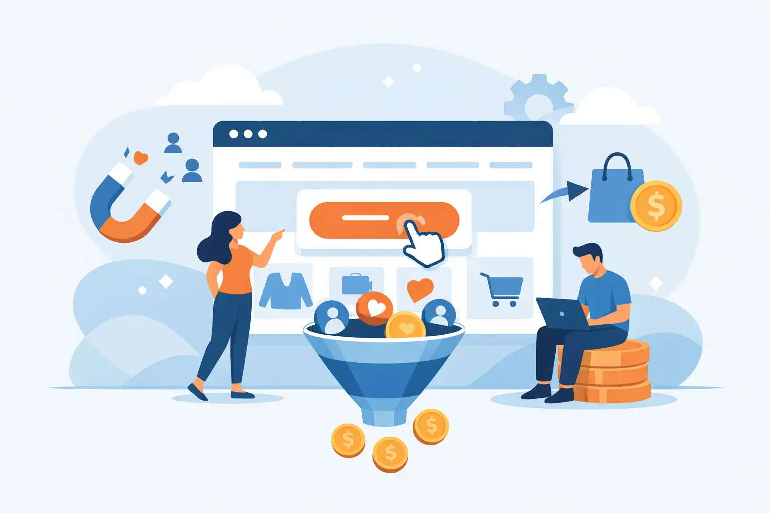
What better results usually look like
When conversion focused web design is done well, the change is not always dramatic from a visual standpoint. Sometimes the site even looks simpler than before. But performance improves because the page is doing less showing off and more selling.
You see clearer user journeys. More qualified leads. Better conversion rates from the same traffic. Lower waste from paid campaigns. Fewer drop-offs on mobile. Stronger trust earlier in the visit.
That does not mean every business should expect overnight miracles. Traffic quality still matters. Offer strength still matters. Sales follow-up still matters. But a stronger website gives all of your marketing a better shot at paying off.
If your site is supposed to help grow the business, it should act like part of the sales team. It should answer questions, remove doubt, and move people forward. Anything less is dead weight wearing a nice design.