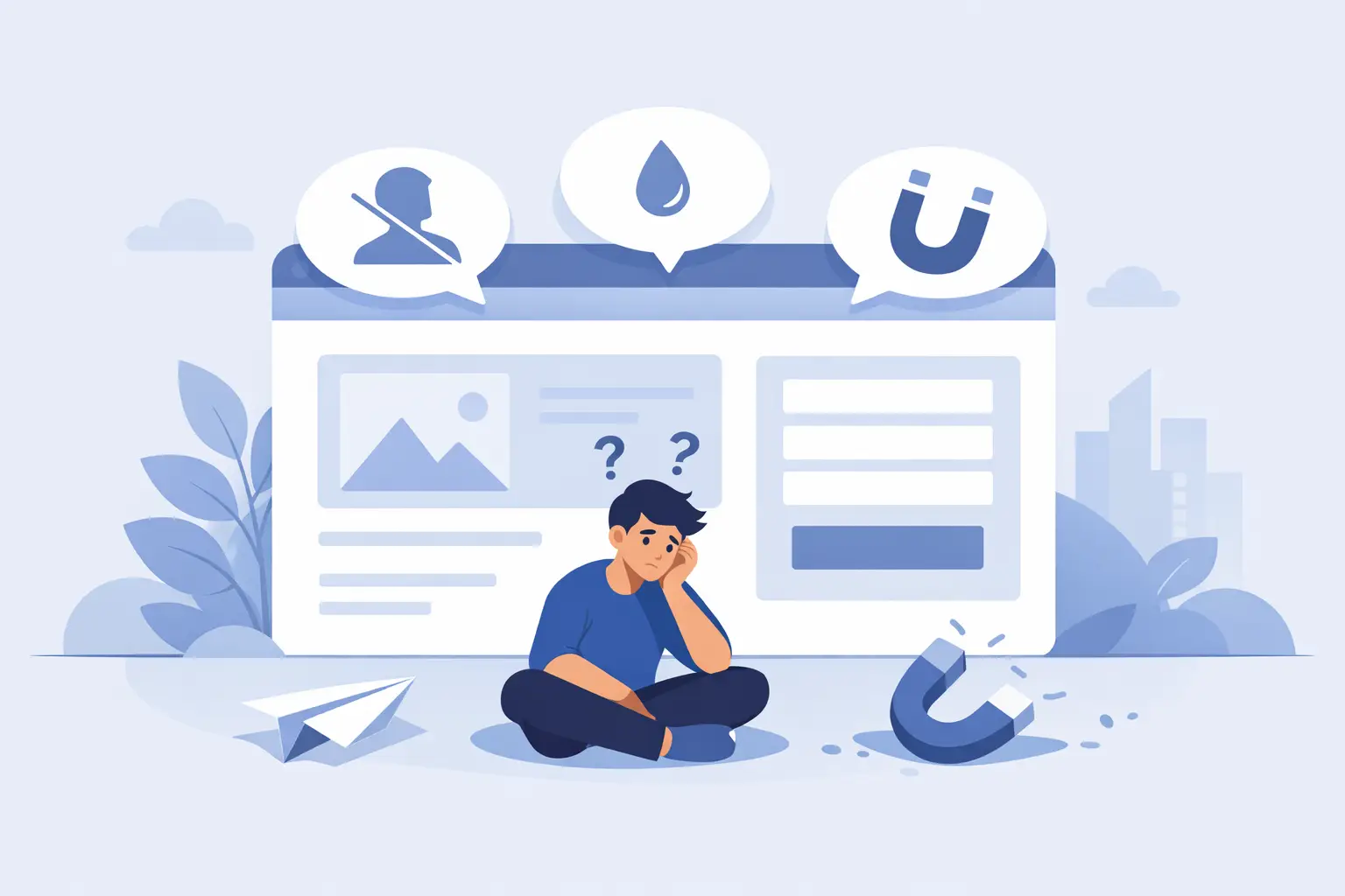
A lot of small business websites look fine at first glance. Then the numbers tell the real story. Traffic comes in, but leads stay flat. People visit service pages, but they do not call. Ads get clicks, but the site leaks conversions like a bucket with holes in the bottom.
That is where website redesign for small business stops being a design project and starts becoming a revenue decision. If your site is slow, confusing, outdated, or built around what you want to say instead of what buyers need to hear, it is not just underperforming. It is costing you money every month.
When website redesign for small business makes sense
Not every site needs to be torn down and rebuilt. Sometimes a few focused fixes can improve performance. But there are clear signs when a redesign is the smarter move.
If your website looks dated compared to local competitors, that matters. People judge credibility fast. A stale layout, tiny text, bad mobile spacing, or stock-photo overload can make a solid business look second-rate.
If your messaging is vague, that is another red flag. Many small business sites talk in broad claims and generic slogans. Visitors land on the homepage and still cannot answer three basic questions: what do you do, who is it for, and why should they trust you?
Performance issues also push redesign into the serious category. Slow page speed, broken layouts on phones, buried calls to action, clunky forms, and hard-to-update content all drag results down. You can pour money into SEO or ads, but if the site cannot convert attention into action, the spend gets wasted.
A redesign also makes sense when your business has changed. Maybe you added services, moved upmarket, narrowed your niche, expanded locations, or shifted from referrals to active lead generation. If the site still represents the old version of the company, it is working against your growth.
A redesign is not about making it prettier
Yes, design matters. People buy with their eyes before they read a word. But the real point of a small business website redesign is not to chase trends or win compliments. It is to create a site that does a better job of selling.
That means stronger positioning, clearer page structure, faster load times, better mobile usability, and more intentional conversion paths. It means reducing friction. It means helping the right customer say, “This is exactly what I need,” and take the next step without hesitation.
Pretty websites fail every day because they are built like digital brochures. They describe the business, but they do not move the buyer. A high-performing redesign does both. It builds trust and drives action.
What a good website redesign for small business should actually fix
The first job is clarity. Most visitors will not study your site. They scan. If your homepage headline is clever but vague, if your navigation makes people think, or if your service pages bury the value, you lose momentum fast.
A strong redesign tightens the message. It gives each page a job. The homepage should orient, build trust, and point people toward the right action. Service pages should explain the problem, the solution, the process, and why your company is the safe choice. Contact pages should remove hesitation, not create more of it.
The second job is credibility. Buyers look for proof. They want signs that your business is established, competent, and worth contacting. That can come from testimonials, project examples, service-specific detail, certifications, years in business, or simply a site that feels polished and current. Weak websites create doubt. Strong websites reduce it.
The third job is conversion. This is where many redesigns miss the mark. They focus on layout but ignore action. What do you want the visitor to do? Call, book, request a quote, fill out a form, schedule a consultation, buy now? That path should be obvious across the site, especially on mobile.
The fourth job is technical performance. A redesign should improve load speed, usability, indexing, and maintainability. If the new site looks great but is still bloated, hard to manage, and invisible in search, that is not progress.
What small business owners often get wrong
The biggest mistake is treating the redesign like a cosmetic refresh. New fonts, new colors, maybe a new hero image. That can make the owner feel better without changing business results.
Another mistake is building around personal preference instead of customer behavior. You may love a certain layout or phrase, but if it confuses visitors or hides key information, it is the wrong choice. Your website is not a private art project. It is part sales tool, part trust signal, part conversion engine.
There is also the temptation to cram everything into the homepage. Every service, every feature, every credential, every thought. That usually creates clutter. Good redesign work is not just about what gets added. It is about what gets removed so the right message can breathe.
And then there is the cheap route. A bargain redesign can look attractive when budgets are tight, but cutting corners here often leads to expensive frustration later. Weak strategy, recycled templates, poor copy, bad mobile execution, and technical shortcuts create a site that still does not perform. Now you have paid twice.
How to approach the redesign without wasting money
Start with business goals, not visuals. What needs to improve? More booked calls? Better lead quality? Higher local search visibility? More quote requests from mobile users? Shorter sales cycles because trust is established earlier? A redesign works better when it is tied to clear outcomes.
Next, look at your current site honestly. Which pages get traffic? Where do users drop off? Which service pages underperform? What questions do prospects ask before they buy? Those questions should shape the redesign more than design inspiration galleries ever will.
Then get your positioning right. If your site sounds like everyone else in your market, the redesign will still feel generic no matter how polished it looks. Clear positioning makes the rest easier. It sharpens the copy, strengthens the offer, and helps visitors understand why they should choose you over the next option in the search results.
After that, the structure matters. Navigation should be simple. Core services should be easy to find. Calls to action should be repeated naturally throughout the site, not hidden in the footer like an afterthought. Forms should ask for enough information to qualify leads, but not so much that people quit halfway through.
Finally, protect what is already working. If your existing site has pages that rank, backlinks that matter, or content that brings in leads, the redesign needs to account for that. A sloppy migration can tank visibility overnight. This is one of those trade-offs that matters. A full redesign may improve conversions but hurt traffic if SEO is ignored. The right move is to rebuild with performance and search in mind from the start.
Redesign vs refresh: what is the right move?
It depends on the gap between where your site is and where your business needs it to be.
If your foundation is decent and the problems are mostly visual or copy-related, a targeted refresh may be enough. That can include tightening the messaging, improving calls to action, updating visuals, and fixing mobile issues.
If the site is structurally weak, difficult to edit, slow, outdated, or disconnected from your current business model, a full redesign usually makes more sense. Patching a broken system can become its own money pit.
This is where experienced guidance matters. The right partner should not push a rebuild just because it is more billable. They should show you where the site is bleeding cash, what needs to change, and what level of work is justified by the opportunity.
What success looks like after a redesign
A successful redesign does not just get compliments from friends or staff. It changes the quality of interaction with your business.
You should see clearer lead flow, better engagement on key pages, stronger mobile performance, lower bounce on important landing pages, and more confidence in your marketing because the site can finally support it. Sales conversations often get easier too. When the website does more of the trust-building upfront, prospects come in warmer.
That is the goal. Not a shinier website. A more useful one.
For a small business, your site should pull its weight. It should help close the gap between attention and action. It should support your sales process, not sabotage it. If your current site looks busy but produces very little, that is your sign. Fix the leaks, sharpen the message, and build something that earns its keep.