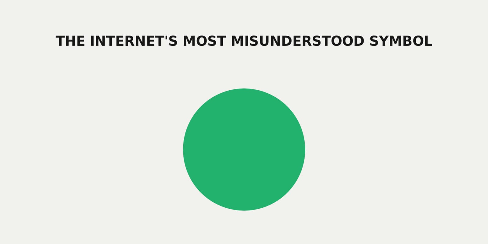
If you create video for a living, aspect ratio is not a technical detail, it is a strategic decision. Aspect ratio is the relationship between a video’s width and height, like 9:16, 16:9, or 1:1. That simple ratio decides how your content shows up in feeds, how it feels on mobile, and how hard your team has to work to repurpose it.
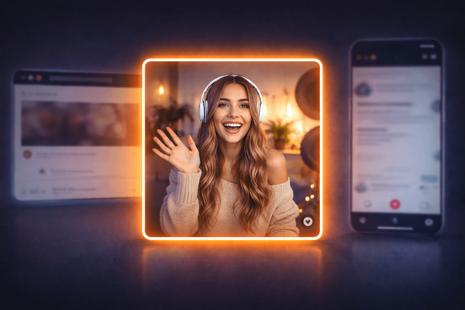
Right now you juggle three main formats. Vertical (9:16) fills the phone screen and rules short form feeds. Landscape (16:9) still drives long form, wide shots, and anything that started life as “traditional” video. Square (1:1) sits in the middle and plays nicely in both mobile feeds and desktop views.
Most agencies still pick vertical or landscape first, then fight with crops and safe zones later. That is where you lose faces, captions, and key visuals. It is also where editing time explodes and your team burns out fixing the same issues on every campaign.
Square is quietly becoming the future forward default. It gives you a flexible canvas that survives platform shifts, layout tweaks, and new placements with far less rework. When you design for 1:1 from the start, you protect your core message, you simplify your workflow, and you keep options open for whatever format the platforms push next.
Why The Square Aspect Ratio Is Gaining Popularity
Square video looks simple, but it quietly solves a lot of problems that vertical and landscape create for you.
First, screen real estate. On mobile, 1:1 grabs more space than landscape without feeling cramped. On desktop, it does not look awkward or “phone only.” You get a balanced frame that keeps faces, text, and key visuals visible in most feeds without weird cropping.
Second, cross platform sanity. When you edit in square, the same master file works in standard feeds, some short form placements, and embedded on sites. You spend less time building separate versions, and more time on the creative that actually moves the needle. If you care about fast hosting and smooth playback, that also pairs nicely with a solid stack like managed WordPress hosting.
Third, attention and engagement. Square keeps the viewer close to the action, especially in tight, personality driven content. You avoid the dead zones you get at the top and bottom of some vertical crops, and you do not waste width like you often do in landscape on a phone.
Finally, repurposing. A 1:1 master adapts cleanly. You can crop a square into vertical or landscape variants with less loss of important detail, which means fewer reshoots and fewer “we cannot use this clip there” moments.
Practical Applications And Best Practices For Square Video
Square video works best when you treat it as your master format, not an afterthought. Build your production flow so 1:1 is the source, then cut vertical and landscape as needed.
Build Your Square First Workflow
- Frame for the center. Keep faces, products, and key actions inside a tight central box so they survive future crops.
- Design safe zones. Plan space for captions, logos, and progress bars inside [insert safe zone guideline] from each edge.
- Write for silence. Assume autoplay without sound. Use bold captions and clear visual cues so the story still lands.
Make Square Content Visually Strong
- Use depth, not width. Stack visual interest front to back. Avoid wide, empty backgrounds.
- Go big on text. Short hooks, large fonts, high contrast. If it is hard to read at a glance, it is too small.
- Lock in a system. Create templates for intros, lower thirds, and end cards so your team is not reinventing layouts on every project.
Plan For Multi Channel Campaigns
- Define a primary square master for each concept, then map where you will cut vertical or landscape variants.
- Align your publishing stack, from scheduling tools to fast hosting like managed WordPress video pages, so you can repurpose once and distribute everywhere.
The Future Outlook: Versatility And Adoption Trends
Aspect ratios will keep shifting, but your team does not have to rebuild its process every time a platform experiments with a new feed layout. Square gives you a stable middle ground that adapts faster than strict vertical or landscape.
Think of 1:1 as your anchor format. As feeds test new placements and surfaces, a square master holds up across most of them with minor tweaks. You keep creative consistent, protect your visual identity, and avoid the constant “reshoot for this channel” loop.
Square also supports cleaner systems. When your agency standardizes on 1:1, you can lock in templates, motion systems, and editing presets. That means faster production, easier training for new editors, and fewer broken layouts when platforms adjust safe areas.
Future proofing is about resilience, not prediction. You do not know which format will trend next, but you can control how painful that shift feels. A square first library pairs well with a resilient tech stack, so if you are already tightening up hosting and distribution with tools like faster delivery for your web video pages, this is the creative side of the same strategy.
The teams that win next are the ones who can adapt content fast without sacrificing quality. Square makes that a lot more realistic.