Three sister companies. One rebrand that had stalled. We turned a tangle of mismatched logos and dated websites into a single, unmistakable family of brands.
Stone Alliance is a Cape Town-based supplier of premium stone surfaces, and it doesn’t operate alone. It’s the parent of two product brands: Origin Quartz (engineered quartz surfaces) and Sinter Surfaces (sintered stone). Three companies, one group, and a real problem: they didn’t look like they belonged together, and none of them looked as premium as the product they sell.
Stone Alliance knew they needed a proper rebrand. They’d already started one with another provider — but it stalled and never delivered the quality they were after. That’s when they brought in GillyTech to take the whole thing over: naming, logos, the full visual identity, three new websites, and custom illustrations. We rebuilt the brand from the ground up and unified all three companies so they finally looked related — while each kept its own distinct personality.
The Challenge
The old branding told three different stories. Stone Alliance wore a muddy tan triangle. Origin Quartz leaned on a busy chrome hexagon. Sintered Surfaces (as it was then called) used a generic grey-and-gold swoosh. Nothing tied them together, nothing felt high-end, and the group’s flagship website was dark, sparse, and forgettable. For a business selling world-class marble, quartz and sintered stone, the brand was undercutting the product at every touchpoint — and a first attempt at fixing it with another agency hadn’t gotten them there.
Approach
One family, three identities
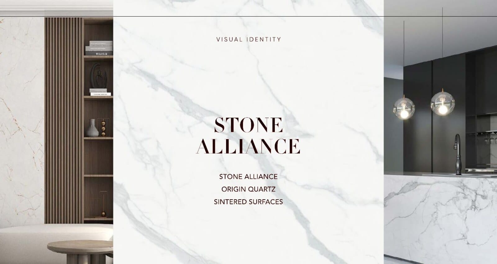
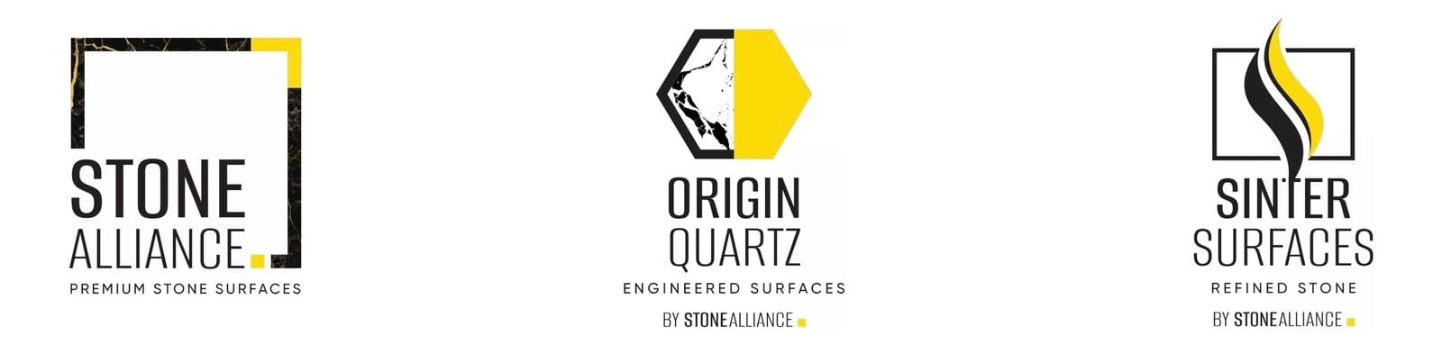
The core idea was a single visual system that could hold three distinct brands. We built the whole family around a shared language — a confident black-and-yellow palette, a marble motif, clean geometric containers, and consistent typography — then gave each company its own icon and character within it. To make the relationship explicit, the two product brands now carry a “BY STONE ALLIANCE” endorsement, so customers instantly understand they’re part of one trusted group. We also refined the naming, tightening “Sintered Surfaces” into the cleaner, more ownable Sinter Surfaces.
The logos, before and after:

From there we built out the full visual identity — primary and icon logo variants, dark and light applications, clear-space and usage rules, and brand guidelines — so the new look stays consistent everywhere the three brands show up.
Three new websites
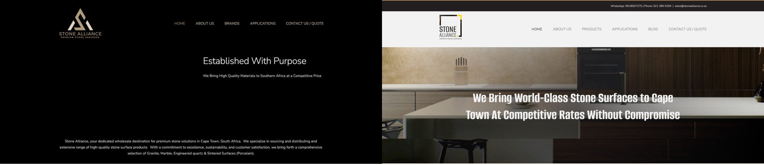
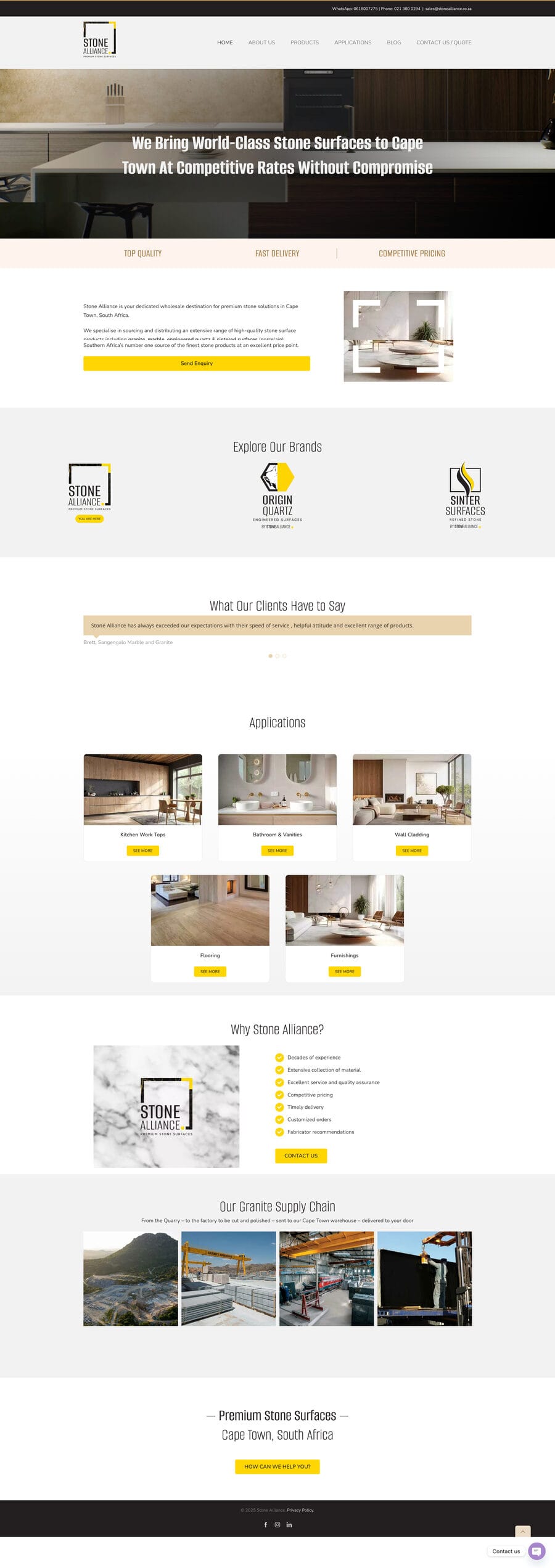
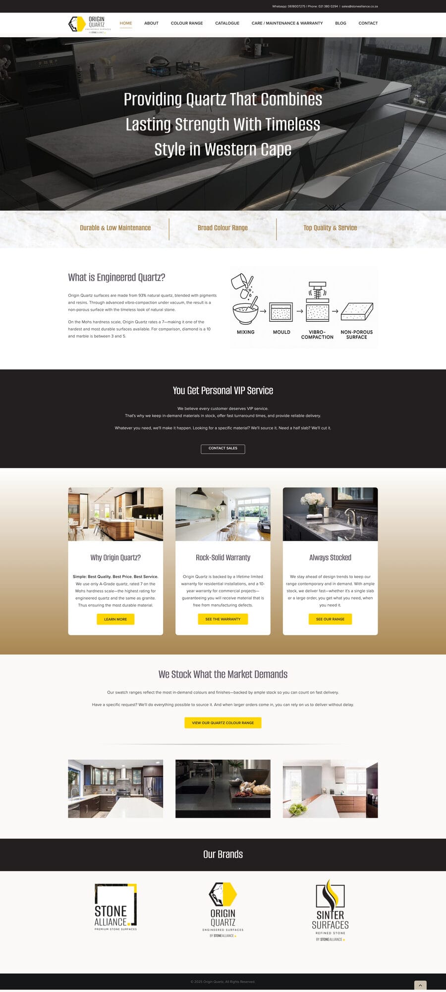
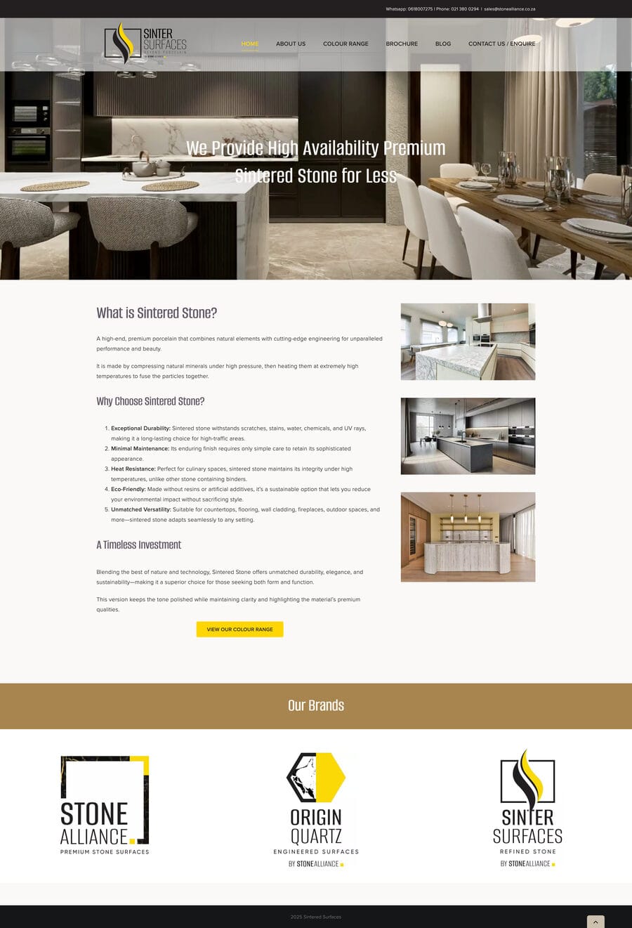
With the identity locked, we designed and built a website for each brand — all sharing the new design language, each tuned to its own products. The Stone Alliance flagship went from a flat, dim page to a warm, confident storefront led by real lifestyle imagery.
Custom illustrations
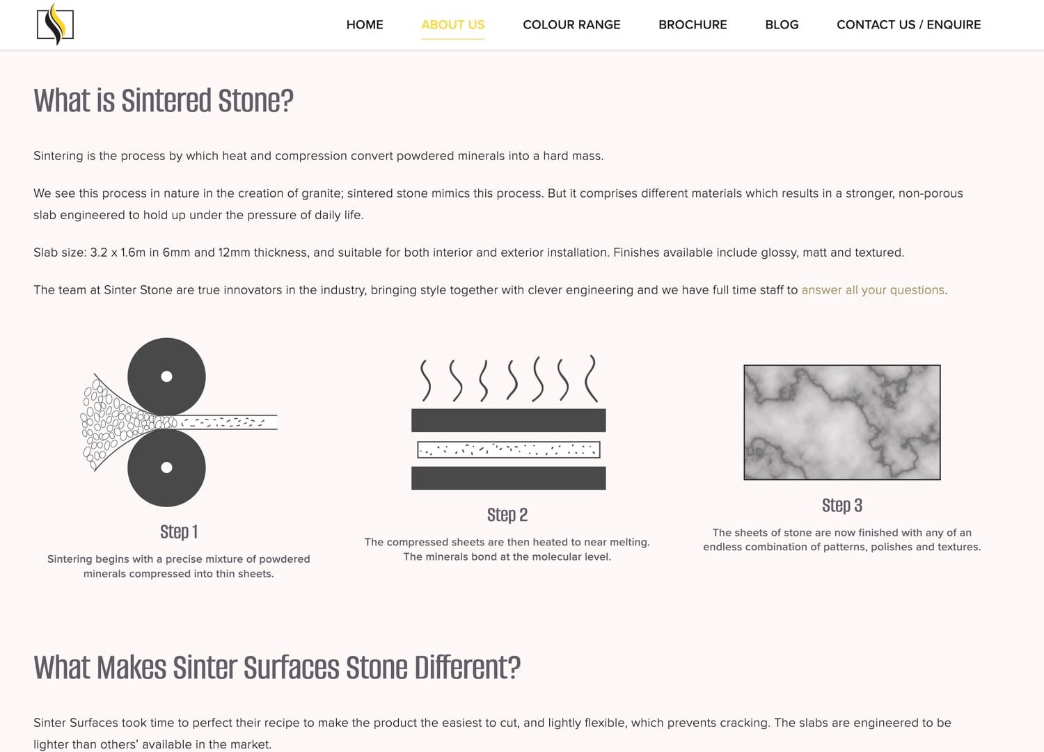
Sintered stone is a genuinely interesting product, but it’s hard to picture how it’s made. So we drew it. We created a set of custom, on-brand illustrations that explain the sintering process step by step — powder compressed into sheets, heated until the minerals bond, then finished in endless patterns — turning a technical story into something clear and elegant on the page.
Solution Highlights
- Unified brand family: one visual system spanning Stone Alliance, Origin Quartz and Sinter Surfaces — related, but each with its own identity.
- Naming + logo suite: refined “Sintered Surfaces” to Sinter Surfaces, and designed all-new primary and icon logos for all three brands.
- Full visual identity: palette, marble motif, typography, dark/light applications and brand guidelines.
- Three websites: a new site for each brand, sharing one design language.
- Custom illustrations: original artwork explaining the sintered-stone process.
The Results
Stone Alliance walked away with a brand that finally matches the quality of what they sell — a cohesive family of three companies that read as one group at a glance, yet stand on their own. Where a previous attempt had stalled, GillyTech delivered the complete package: names, logos, identity system, three websites and bespoke illustrations, all pulling in the same direction.
Get in Touch
Rebranding a company — or a whole family of them — is one of our favorite kinds of work. If a project stalled somewhere else, or you’re starting fresh, reach out. We talk real solutions, on time and on budget.
More Case Studies
See how we have helped other businesses grow.